Kaliro
A community management dashboard for creators and small business owners.
All work shown is the property of Kaliro. Shared with permission for portfolio purposes only.
Project Summary
Kaliro needed to translate early mid-fidelity concepts into a cohesive, production-ready platform.
The challenge was to design a unified experience that allows users to efficiently manage their members, brand presence, and payments in one organized space.
The Problem
I designed key areas of the Kaliro platform including the dashboard, business hub, and member manager, to create a more intuitive, accessible, and scalable experience.
My work established visual consistency, improved usability, and helped align the interface with real user needs.
My Role
My Role: UI Designer
Team: UX Researcher, UI Designer (me), Software Engineer, Project Manager
Tools: Miro, Figma
Timeline: Nov 2024 - May 2025
Project Details
User Research
User research was led by Marvin Smith & Malika Johnson whose insights informed the design direction.
Three key personas: Creator (Quinn), Business (Riley), and Community (Morgan), represented distinct user groups whose priorities in engagement, payments, and community management directly shaped both Kaliro’s structure and pricing model.
These needs were reflected in the app’s main sections: Dashboard, Business Hub, and Membership Manager.

Three Personas: Three Client Tiers
Quinn is an influencer who focuses on fitness and lifestyle. They’ve successfully transitioned from being a personal trainer to running a digital-first business that combines e-commerce with strong community engagement.
Creator

Riley owns a barbershop that prioritizes a customized client experience and offers tiered memberships. Beyond haircuts, their shop serves as a community hub, hosting events that foster connection in a comfortable, welcoming space.
Business

Morgan works with professionals in the self-education space. With experience spanning both corporate and entrepreneurial ventures, they’ve developed expertise in creating sustainable, revenue-generating communities across multiple platforms.
Community

“Running a successful business isn’t just about sales - it’s about building a community that supports each other’s growth while staying true to our values.
I need tools that will help me balance efficiency with authenticity, allowing me to scale without losing the personal touch that makes our brand special.”
User Needs

Integrated platform management
Bird’s eye view of their community in real time.

Membership management & payment processing
Streamlined way to handle transactions and subscriptions.
Multi-level access control

Membership tiers and permission-based controls to maintain oversight across various business models.
Design Work
I joined the project after the initial structure was defined by the UX team, led by Malika Johnson. The mid-fidelity wireframes below served as my starting point. From there, I refined the layout, hierarchy, and interaction details to achieve the final high-fidelity design.
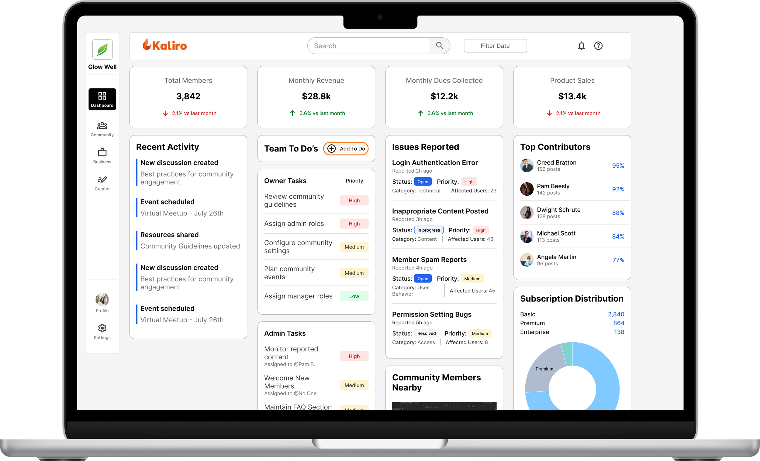
Dashboard
Mid-Fidelity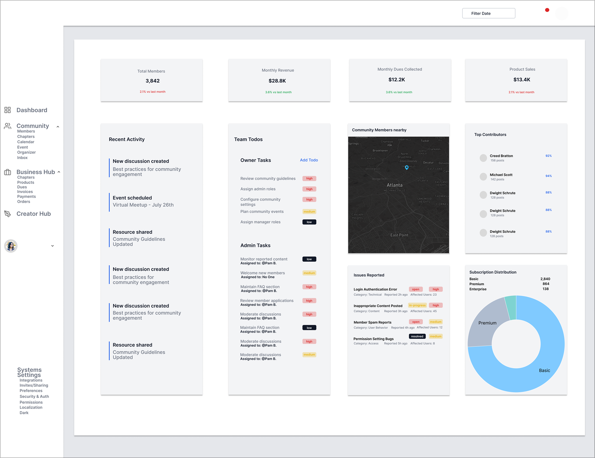
A central hub to track engagement metrics, team tasks, report issues and overall business performance.
What it does
Dashboard
High-Fidelity
Established a grid system and designed for a standard screen size.
Defined color and text styles to assist with hierarchy, minimize cognitive load, and align with accessibility standards.
What I did
Business Hub
Mid-Fidelity
Users can manage membership dues, product payments, and edit membership tiers.
What it does
Business Hub
High-Fidelity
Continued using the grid system established with the dashboard to create standardized cards.
Introduced a clear CTA on this page and established visual hierarchy using cards and white space.
What I did
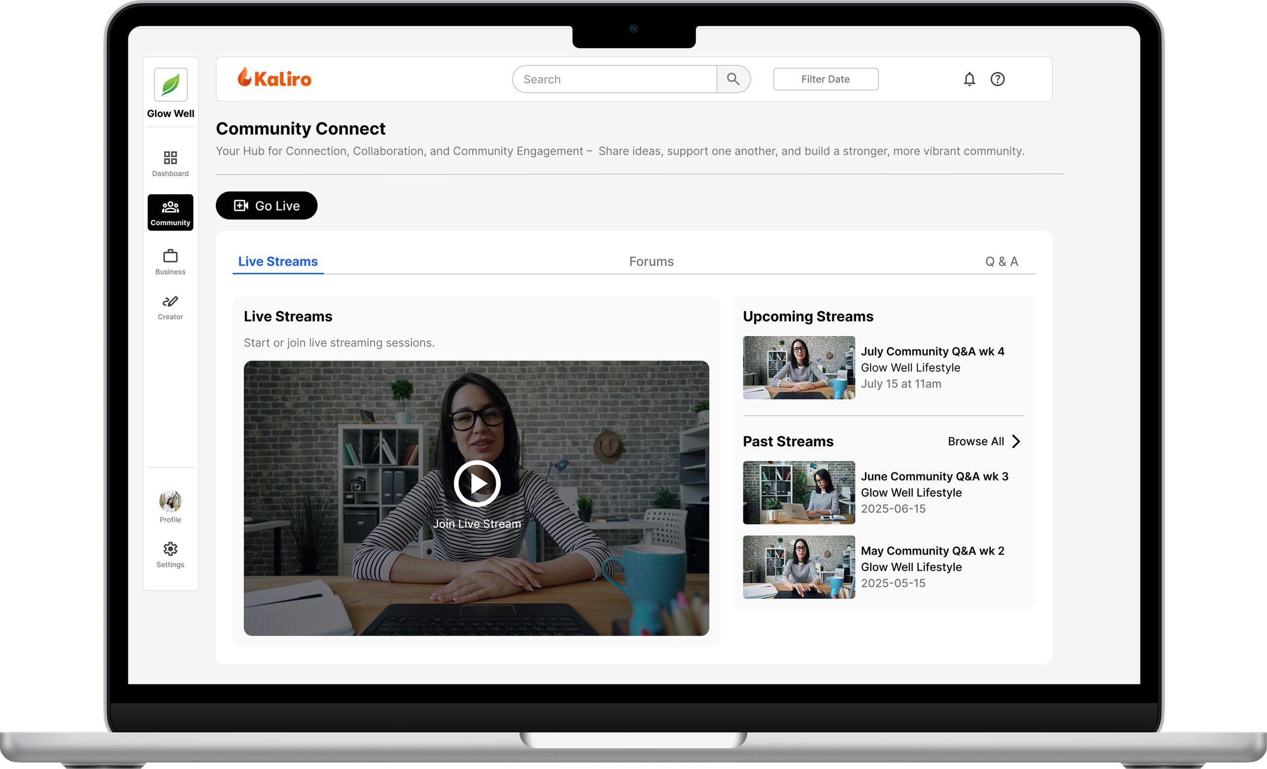
Member Manager
Mid-Fidelity
Enables users to view membership status and activity within their community.
What it does
Member Manager
High-Fidelity
Created a clear CTA through better organized & standardized buttons.
Augmented the table component I designed for the business hub to surface a lot of information in a digestible format.
What I did
Mobile
High-Fidelity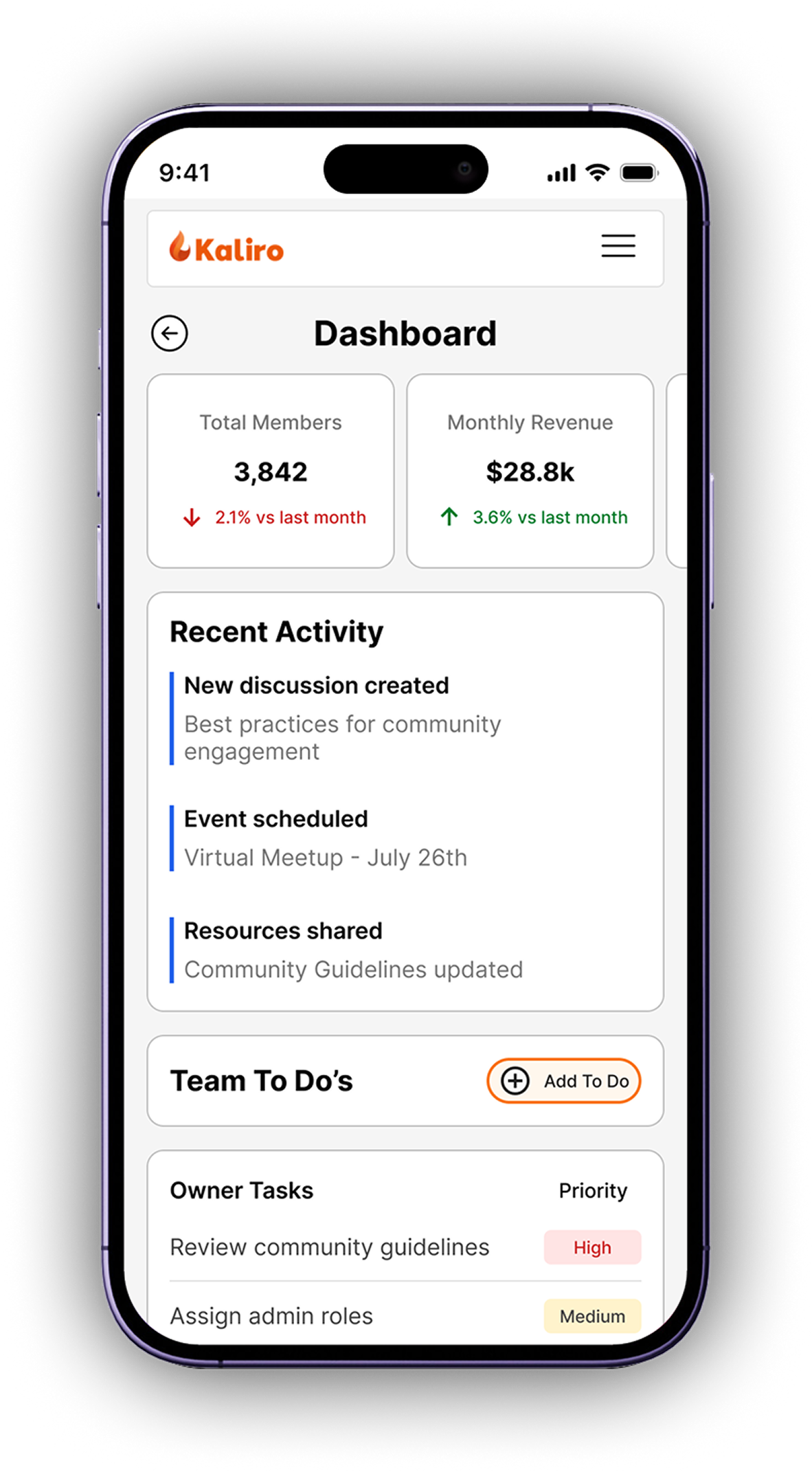


Created a mobile version of the core product, hiding some elements to reduce cognitive load and maintain user attention on central CTAs.
What I did
My Approach
User-Centered
My designs focus on reducing cognitive load, optimizing workflows, and ensuring usability based on real user needs.
Scalable
The grid system, reusable components, and adherence to accessibility standards ensure a consistent experience across Kaliro's platform.
At Kaliro I transformed a complex platform into an intuitive, accessible, and visually engaging experience, empowering users to manage their communities effortlessly.


All work shown is the property of Kaliro. Shared with permission for portfolio purposes only.